ERNiE: The Manual
The Encyclopedia of Romantic Nationalism in Europe is accessed in a browser at http://ernie.uva.nl
Contents of this manual
- Top menu and search box; sorting the list view
- The Encyclopedia and its articles; The Bibliography; contributors
- Scenario buttons, view modes and visualizations [this page]
- Materials: Letters, Writings, Music, Paintings, Monuments, Sites, Currency, Exhibitions
- Making your own ERNiE selections
- Further references and information, copyright, feedback
Scenario buttons and view modes

Most items in the top menu show a start screen headed by one or more scenario-buttons. Scenarios provide illustrative pre-selected dataset samples. These datasets can be displayed in various forms: as sortable/searchable checklists, or as visualizations. These visualizations can take the form of a chronological chart, a social-network graph or a geographical map. Available view modes are indicated by icons.

The visualizations
The visualization can be clicked/dragged, and zoomed in and out with the zoom level control. The interface controls can be shown or hidden and the visualization can be rendered full-screen by clicking the appropriate icons.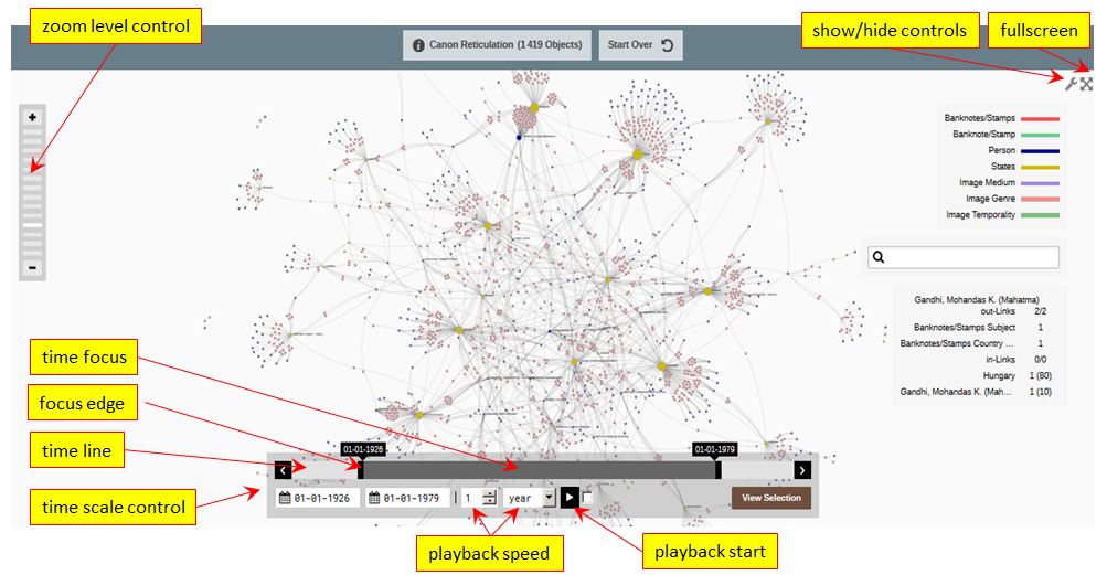
The time scale control
ERNiE’s visualizations are, crucially, diachronic and historical: they map connections over time. To see how social or geographical connections develop and morph over time, the time scale control is the user’s primary tool. The chronological spread of the data selection is indicated by the time focus; the begin-date and end-date of the selection are the focus’s outer edges.
The time focus can be narrowed or widened by click-dragging the focus edges or by setting the date values. The focus as a whole can be click-dragged along the time line. The graph will fluidly adjust to reflect these shifting chronological settings.
The development of the dataset over time can also be displayed dynamically by clicking the playback button. The speed of the visualization playback, moving from the begin-date to the end-date of the chosen time focus, can be adjusted in the playback speed settings.
A note on social graphs
Social graphs display network structures as dots connected by lines (or, technically, “nodes connected by edges").
- Nodes that are quantitatively important (with many contacts) are larger in dot size.
- Nodes that are qualitatively important (with well-connected contacts) are given a more central position in the graph.
You can try out these features by going to the scenario illustrated in the screenshot above. It visualizes the growth of historical canons of great national figures celebrated by portraits on postage stamps.
- In an early phase (prior to 1948) these national-historical canons are separate by country
- From the mid-century on, internationally celebrated figures like Charlemagne or Marie Curie build bridges between national sets. The Communist world is connected through its international icons. At the centre of the graph, indicating a high degree of transnationalism, smaller (philatelically productive) countries are to be found, as well as come hypercanonical figures like Goethe or Mozart.
- Transnational connectivity declines again after 1975.